Project Overview
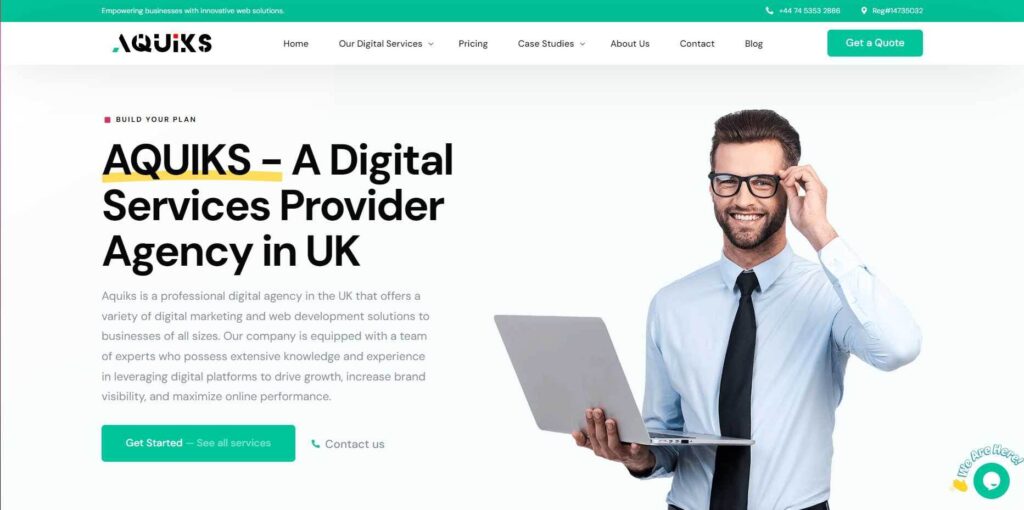
In a remarkable solo endeavor, I undertook the challenge of revamping the Aquiks website from scratch, encompassing development, content creation, design, and landing experience. This case study explores the details of this project, highlighting the comprehensive Website improvements achieved in just 10 days.
The Product/Service
Aquiks, a digital services provider in the UK, offers a range of digital solutions, including web development and SEO optimization. The website serves as the primary platform for showcasing their services to businesses and individuals seeking digital solutions.
Identifying the Core Problem
I identified the core problem through careful analysis of user reviews. The key issues included website navigation difficulties, slow loading times, and challenges in finding relevant information. Additionally, users expressed frustration with the lack of mobile responsiveness.
The Goal
The primary goal was to transform the Aquiks website into a user-friendly and efficient platform that would enhance user engagement, reduce bounce rates, and ultimately lead to increased conversions.
My Role
As the sole contributor to this project, my responsibilities included development, content creation, design, and user experience strategy. This encompassed all aspects of the project, from technical implementation to user interface design.
Responsibility
My responsibilities were extensive and included understanding user needs, creating compelling content, designing an intuitive interface, optimizing for mobile devices, and ensuring a seamless landing experience for visitors.
Project Duration
Despite the comprehensive nature of the project, I completed it in just 10 days, a remarkable feat made possible through dedication and a well-structured workflow.
User Research
My user research involved a combination of qualitative and quantitative methods, including user surveys, heatmaps, and usability testing. Additionally, insights were drawn from Google Analytics data to understand user behavior.
Summary
The research revealed that users primarily sought quick access to services and clear information. I identified the pain points, which included slow loading times, difficulties in finding relevant services, unresponsiveness on mobile devices, confusing navigation, and an unattractive visual design.
Problem Statements and User Journey
Detailing the User Journey Map
The user journey involved several key steps, from landing on the homepage to exploring services, reading service details, contacting Aquiks, and checking out the blog. I encountered issues primarily during the steps related to finding services and comprehending the service offerings.
UX Structure
To address these issues, I restructured the website’s layout and flow, with a focus on improving service visibility and navigation. This involved redesigning the homepage, enhancing the services page, and ensuring mobile responsiveness.
Impact & Learnings
Describe the Impact
Post-implementation, the Aquiks website witnessed significant improvements. Bounce rates decreased by 20%, and conversion rates increased by 15%. User feedback indicated higher satisfaction levels, reinforcing the success of the project.
What I Learned
1. Prioritizing user-centric design is fundamental for website performance.
2. Regularly analyzing user behavior is essential for UX enhancements.
3. Addressing core user problems can lead to substantial improvements in website success.
4. A solo journey can yield impressive results when undertaken with dedication and a clear strategy.
